 Don’t you wish it was easier to compare social media networks side-by-side? You know, a really cool chart to summarize what’s going on in the network, so you can answer client questions more easily or find that key statistic to drop into your presentation.
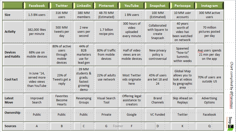
Keeping up with the news of each network is tough, even for communicators working in this area. So I created this side-by-side chart to compare the top 8 social media networks so I can answer the questions my clients ask more quickly and without duplicating my research string over and over again.
I compared Facebook, Twitter, LinkedIn, Pinterest, YouTube, Snapchat, Periscope and Instagram and looked at 6 factors: network size, activity, devices and habits, cool facts, latest move and ownership.
Each network is so different. Sometimes it’s really hard to compare them. Size is important when you are counseling clients on using social media resources, but some networks may not report their size. The way social networks report their Activity can also be confusing, but it’s my hope that the activity metric gives an indication of what’s going on there. For the Devices and Habits category, I had been watching the switch to mobile use for my clients, but now that some of our biggest networks are on mobile only — like Snapchat and Periscope– the category had to change slightly. The Latest Move section allows me to look at the business side of the network and how these networks are changing to meet the needs of their users. Ownership is an ongoing concern for me as a media watcher. Who owns what is important and as you can see from the chart, the ownership strings are complicated. Who doesn’t love a Cool Fact to share with their clients?
Using 36 different sources, I gathered the information into this chart, which isn’t very readable here. So I’ve provided a download link below, so you can look at it more closely. Use it for your business or nonprofit, or maybe to win a trivia contest, but PLEASE, if and when you share it, please note and credit the sources of information in the accompanying citation sheet.
Social networks are growing and changing so quickly, it’s hard to keep up. Having a comparison chart helps me talk to clients about their mix of social channels. Maybe it will help you too.
What would you like to see on this chart the next time I update it?
Download the Social Media State of the Networks Comparison Chart.

