You are, of course, looking deeply at your Facebook insights to see how your fans are interacting with your organization, and analyzing what content resonates with your community. But you can make some instant observations by looking at that little chart which is nestled just above the cover photo and between the “New Likes” and “Page Tips” section.
If you are managing more than one page, this is a quick benchmark to see how your pages stack up against one another.
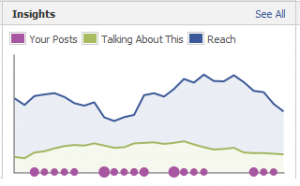
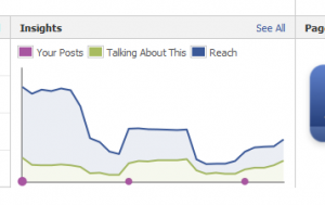
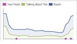
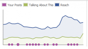
As a refresher, the purple circles along the bottom of the chart represents posting frequency by the page owner. The green trend line above it represents actions taken by fans. This includes liking the page, or a post on the page, sharing something from the page or commenting on the page. The blue trend line above that is what Facebook calls Reach. It’s a complicated Facebook formula but basically take your fans and multiply it by how many people they are connected with or have “friended” on Facebook and you get a sense of the magnitude.
Here are some samples from client pages I have managed with some observations I used to examine next steps with the client.
On a Roll
This organization is doing well with creating frequent posts and interacting with their fan base. Their fan base is engaged.
Hiccup
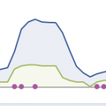
This organization may have been on a roll, but recently had some kind of hiccup with their content strategy. Go back to the date to see what suddenly changed and see if it can inform better decision-making in the future.
Abandoned
Someone gave up on this page. It happens to many organizations. Usually it means the page owner got reassigned or too busy to keep the home fires burning.
Smokin’ Hot
This organization is burning up the charts with strong content and continuous growth.
Burnout
This little chart shows how easy it is to reverse the “on a roll” trend.
Have you seen a page like one of these? Did it help you make new decisions? I use this short exercise once or twice a month to see where I need to look next for insight.
