Late last year, I shared my experience using the new Pages To Watch Function on Facebook, which was being rolled out to brand pages.
Some of its functionality has been enhanced in the last couple of weeks, so I thought it was time for an update.
New Location for Pages to Watch
The original location was above the page’s cover photo. You can still find it there, but if you go to your Insights page, then click on Overview and scroll down, you will see a larger version of the graph, with some additional features.
There are three new functions which have been added. They are useful if you are benchmarking your Facebook page against competitors or against similar organizations who aren’t direct competitors.
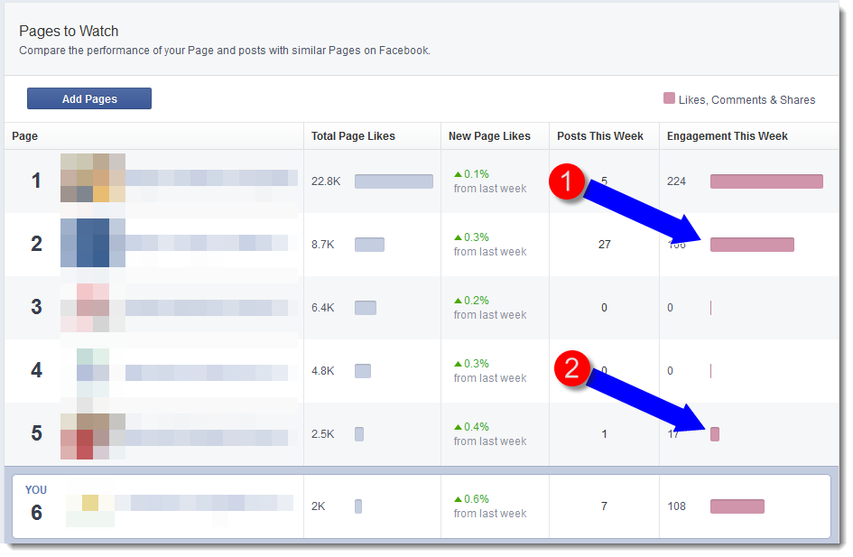
- You can see increase in growth of fans on the pages you are watching through the Total Page Likes Column and the New Page Likes Column, which is expressed as a percentage. Green is up; red is down.
- A new feature I like is the column which shows number of posts. For some of the smaller brands for which I track competition, I used to visit each of their pages individually and count how many posts they were doing per week, and then average it. This saves me a lot of time.
- A new column to track Engagement gives you an idea of how you are engaging with the fans on your page against your competition. You definitely want to be Brand #1 on this graph and NOT Brand #2.
There’s no doubt that Facebook will be trying to monetize this or work the data in some way to inspire you to purchase ads. So it’s anyone’s guess whether this feature evolves to be more or less useful.
BUT, if you are working with a client who is watching their competition in other facets of their marketing campaign, this graph does give you a snapshot of what’s happening. It is not in-depth by any means and it doesn’t give you any trends, but it can certainly spark discussions around your engagement level, your content strategy and channel integration.
Have you used this new chart? If so, I’d like to hear whether it’s useful to you and what features are most helpful.